February 9, 2023
Picture this: You arrive at a conference hall, excited to hear the speakers and get some great industry insights. In an instant, your enthusiasm is crushed as you’re forced to take a spot right up against the speaker’s plinth. An overcrowded venue – ah, a tragedy. The frustration is similar to the feeling of standing beside a blaring coffee machine at a much-anticipated concept launch. Don’t let your own audience suffer this way.
5 Presentation venues explained
Below you’ll find a list of meeting venues, with details about their capabilities and limitations. I’ll give you some tips for each, and explain how to optimize the spaces to ensure your audience experiences something memorable.
Don’t have time to read the full blog? Skip to the venue type you’re most interested in:
1. Private rooms to large boardrooms – Co-working Spaces
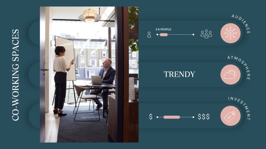
Workspaces are not new to freelancers and small business owners. But in the world of full-time employees and start-ups, these locations are rather novel.
Co-working spaces are not only a great place to immerse yourself in peace and focus. They’re also a dynamic location for your next keynote presentation. Most, if not all, co-working centers offer private rooms with all the right technology to bring your presentation to life.
Key factors to look out for when choosing a co-working meeting room:
-
- The view – Don’t fall for the room with the best view. You want your audience to focus on your presentation, not the twinkling seaside. Opt for the nifty wallpapered room instead. If you really want a pretty view, choose a room overlooking a quiet scene, with little movement outside (which won’t distract your audience).
- Arrival time – Does the workspace allow you to arrive a half-hour early to set up? Ask for that opportunity. You should feel prepared when starting the meeting.
- Parking – Often workspaces are tucked away between busy city streets. Find a workspace that provides parking nearby and be sure to let your guests know the parking situation.
- Traffic – Not the honking kind. If it’s a busy co-working space, try to book a room that’s away from all the foot traffic. Too much external movement can easily turn your audience’s attention away.
- The view – Don’t fall for the room with the best view. You want your audience to focus on your presentation, not the twinkling seaside. Opt for the nifty wallpapered room instead. If you really want a pretty view, choose a room overlooking a quiet scene, with little movement outside (which won’t distract your audience).
Also, read the “key points to look out for when choosing a conference center” as they relate to co-working spaces too.
2. Keep it intimate – Coffee Shop Meetings
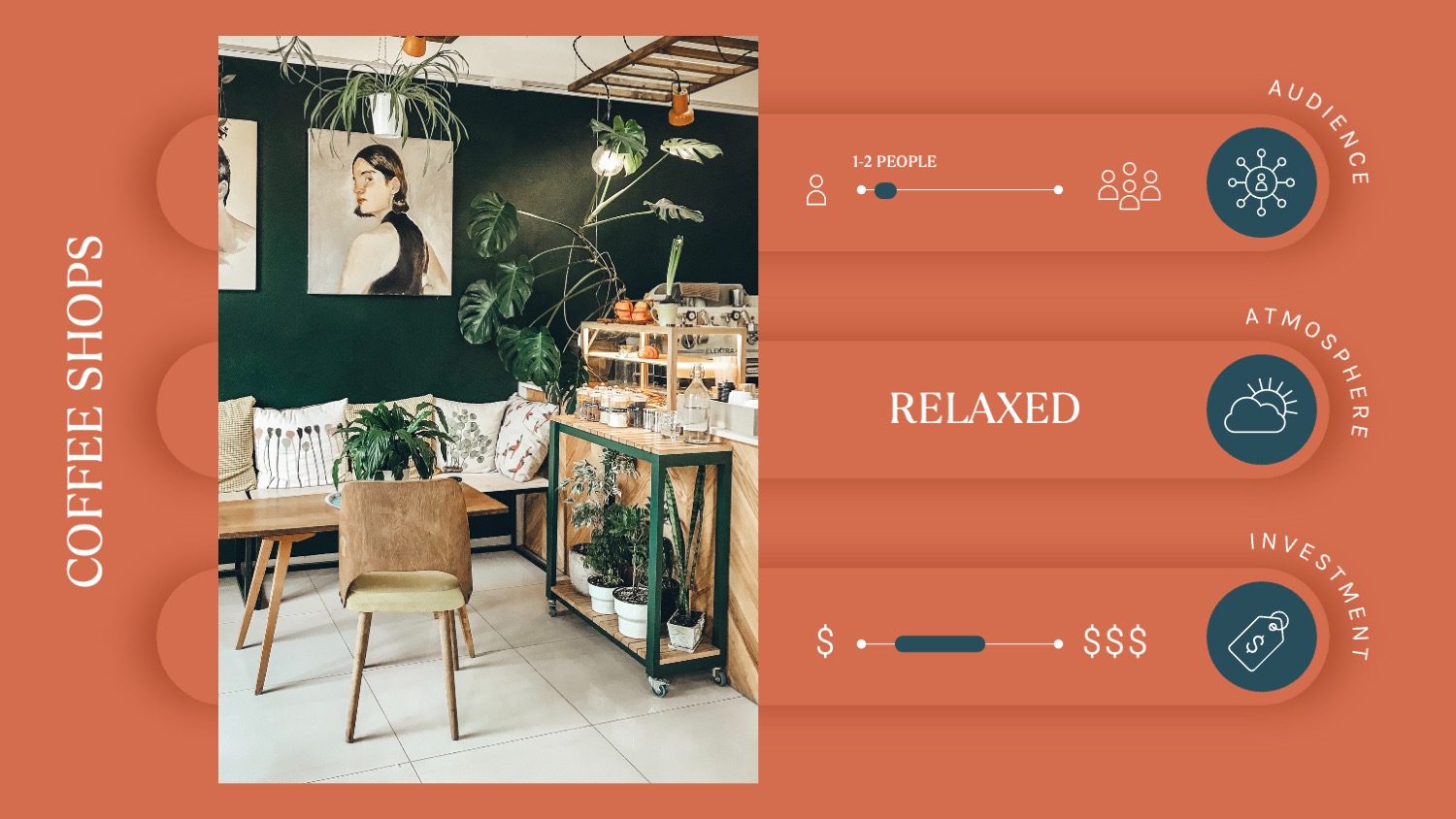
Meeting 4 or fewer people? Opt for a coffee shop. Gathering around a little café table sets the perfect scene for an intimate but professional discussion. Being up close and personal with your audience helps you to gain their trust.
Key factors to look out for when choosing a coffee shop:
-
- Privacy – You need a space where you can discuss potentially confidential details, while not being bunched up together like a bouquet of roses. In other words, choose a table that is spacious and away from the crowd.
- Comfort – Look for the table with the comfiest chairs. Physical comfort puts your audience at ease mentally, freeing up brain space for them to take in your fabulous presentation.
- Noise – A venue with live music and young crowds is not the way to go. Your listeners need to concentrate on you, not the background noise.
- Privacy – You need a space where you can discuss potentially confidential details, while not being bunched up together like a bouquet of roses. In other words, choose a table that is spacious and away from the crowd.

Pro tip: Mention to your waiter beforehand that you’ll be in an important meeting and suggest they only come to the table a few times For example, once when your clients have taken a seat and the next when you’ve closed your laptop to mark the end of the important section to the meeting.
3. Stick to traditions – Conference Centers
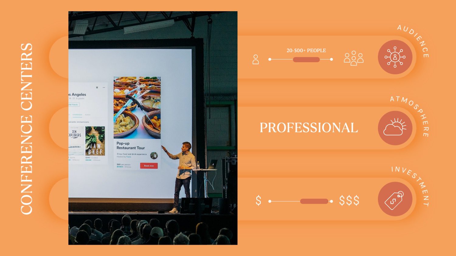
Conference centers are a fool proof presentation venue. Generally speaking, these centers are best for large gatherings. However, some centers do have smaller rooms too.
Key factors to look out for when choosing a conference center:
- Seating – How many people will be attending your presentation? Make sure there is enough seating in your venue to fit everyone. You wouldn’t want anyone standing, stealing your limelight.
- Electronics – With big centers, you’ll need a lighting expert, a sound engineer and an easy to view screen.
- Snacks – Will there be more than one speaker? If so, ensure that there is a snack hall for the intermission. Additionally, if guests have to pay for snacks at the presentation venue, make sure that various payment options are available and convenient.
- Facilities – Does the venue have easy parking? Are there working toilets, clean water, and large windows showing the sky rather than busy streets? These will all affect how much your spectators enjoy your presentation.
Remember, first impressions are everything. Find a conference center that is in a neighborhood which gives off the vibe you want your clients to feel from you. For example, if you’re pitching to a Fortune 500 company, you should go for a high rise building near important landmarks.
4. Be a time saver – Home Office Space
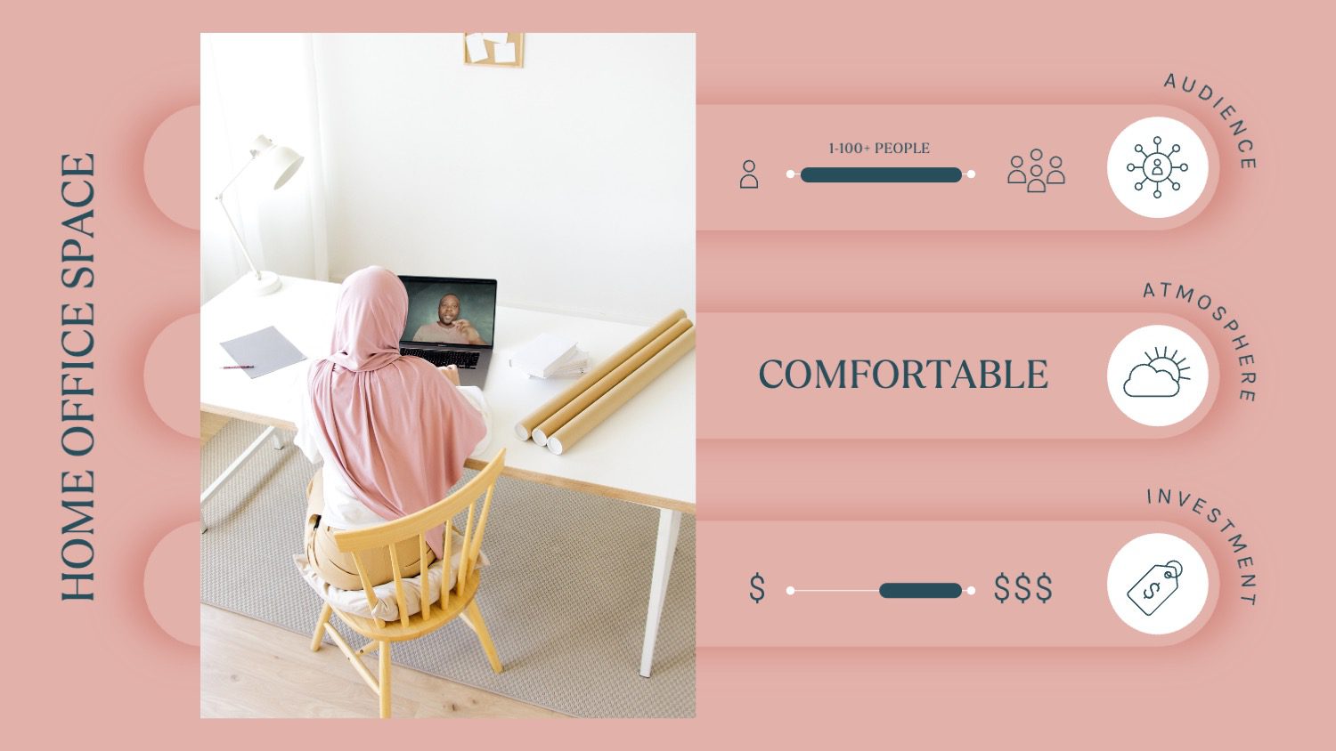
Time and money is not always on our side. Using your home as a presentation space is a convenient option, especially if you want or have a global audience. And, if the pandemic has taught us anything, virtual presentations can be done… and can be done well.
Key factors to consider when setting up a virtual presentation venue:
- Background – It’s a fact, your viewers are going to judge what’s on the screen around you. So set up a calm scene or choose a spot in your home that is clutter-free.
- Tech – Zoom, Google Meet, Microsoft Teams, Skype, you name it, become a pro at presenting, sharing your screen, and using all features of your chosen software, before your meeting. You don’t want to show your presenter notes by mistake, do you?
- Camera – Consider getting yourself a good webcam to up the quality of your video. A better camera shows more professionalism.
- Lighting – Ring lights are all the rage but if you have a window in front of you, that’ll work equally well (sometimes better).
- Sound – Though some meeting platforms have background noise reduction technology it’s still wise to keep the washing machine off or ask your kids to play in the garden away from your window.

Pro Tip: Wear glasses? See how expert, Gia Goodrich, suggests lighting tips for key speakers with glasses.
5. Go Rouge – Unique Venue Ideas
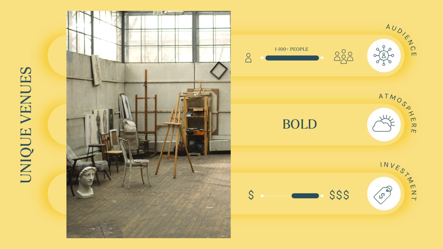
Make yourself memorable by choosing a presentation venue that your audience wouldn’t even think of. These are best for once-off pitches or product launches where you want to gain people’s attention and get them to start talking and invest in your idea. For example:
-
- Barns
- Art Galleries or Studios
- Museums
- Abandoned Buildings
- Gin Distilleries or Breweries
Key factors to remember when choosing a unique venue:
- Acoustics – Sometimes a great sound technician just isn’t enough. The presentation space itself contributes to the sound. For instance, a huge empty hall will have great acoustics while a smaller venue may not. Think about what you need and go from there.
- Visibility – If you and your screen can’t be seen from every point in the presentation space, it’s best to find a different venue.
- Help – You can’t be a master of everything. And in any case, you want to focus your attention on your guests and the points you’re making. Hire people to help you with everything else.
- Weather – Outdoor venues and abandoned buildings will be affected by weather. If it’s wintertime, stick to safer options.
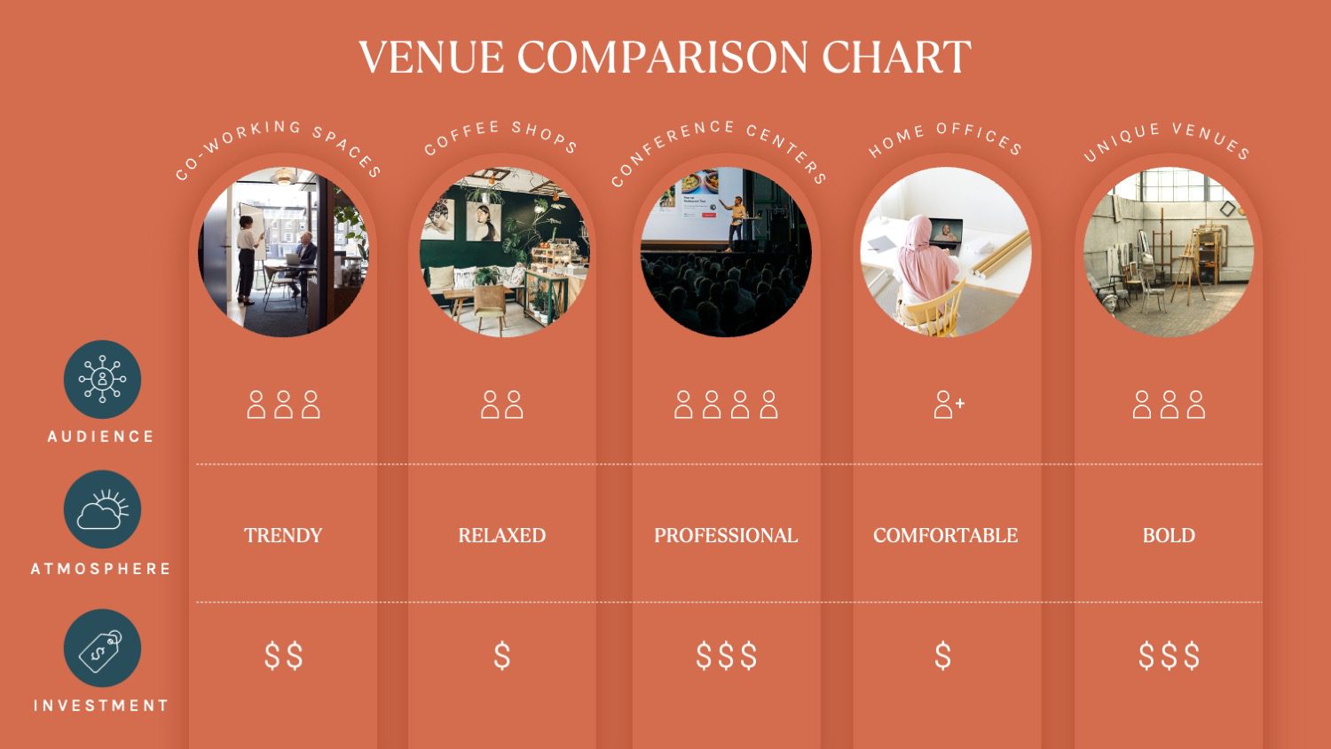
Master your presentation venue choice
So what are the key takeaways? Make sure the size of the meeting room is an appropriate size for your audience. And, ensure the surroundings match the concept you want to talk about. Most importantly, get all eyes on you – no external distractions!
I'm Marike
I provide professional presentation design services specializing in PowerPoint, Keynote and Google Slides.
Follow me on social:
Buy US a coffee
Enjoying the content?
Show your appreciation...
YOUR Message*
YOUR NAME*
YOUR Email Address*
What's the slide count?*
where are you based?*
I'm ready! let's start
By clicking the submit form button you agree to my Privacy Policy.
Mail me directly at:
info @ marikedesigns dot com
June slots are available. Book now.
how did you find me?*
What's your deadline?*

