
June 23, 2025
A well-put-together PowerPoint presentation can take hours to design. Most business people know that from experience. Another common experience is crafting a presentation and spending excessive time trying to align elements only for components to still look disordered and cluttered.
Luckily, there’s a solution for this problem readily available. Visual appeal and straight lines to tighten up your message can be achieved with guides.
Guides can help you get that elusive alignment, help you maintain consistency, and ensure a professional visual flow. This blog post will walk you through where to find guides, how to set them up, the best grid ratios for different types of presentations, and some useful shortcuts and tips.
The case for using guides in PowerPoint and Google Slides
Guides are horizontal and vertical lines that act as rulers on your slide. They will appear as a grid, giving you the helping hand you need to set elements up in an orderly and neat fashion.
While guides don’t appear when you present, they help with consistency that guides during setup, which makes your slides more readable. As a result, your message is more engaging and your points are easier to follow. Of course, that’s what you want when you’re presenting your slide deck to a board of executives or potential investors.
Guides in PowerPoint and Google Slides are truly valuable tools. Yet, the design aid is so often overlooked.
Now that you’ve heard of it though, how about you unlock their power and give it a try?
Finding and setting up guides
Imagine magic lines that help you to lay out elements in perfect alignment. Sounds like a real time-saver right? Well, it doesn’t have to be just in your imagination.
Activate guides in PowerPoint
Below is everything you need to know about setting up guides in PowerPoint quickly.
Where to find guides:
- Go to the “View” tab on the Ribbon.
- Check the “Guides” box in the “Show” group to display guides on your slide.
Setting up guides:
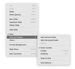
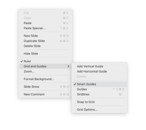
- If you have an existing guide, right-click on it to add new vertical or horizontal guides. If you don’t have an existing guide, first add one by right-clicking on the slide of a slide and navigating to “Grid and Guides > Add Vertical Guide/Add Horizontal Guide”.
Note that if you are using master slides and guides have already been added on that level – perhaps provided by your internal design agency or by a presentation designer – then the guide cannot be moved. If you add guides on a slide level, they can be moved.
- Drag guides to position them where you need them.
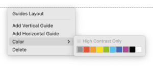
- To change the color of a guide:
- On Pc: Right-click the guide and select “Format Guide,” then choose a color.
- On Mac: Right-click the guide and navigate to “Color > [your preferred color].
Shortcut keys:
- Show/Hide Guides on PC: Press Alt + F9
- Show/Hide Guides on Mac: Press ⌘ + Option + Ctrl + G
Activate guides in Google Slides
If you’re more of a Google Slides user, you won’t miss out! You can access guides like this:
Where to find guides:
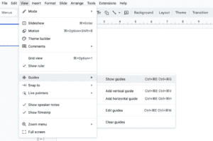
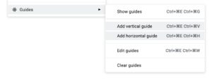
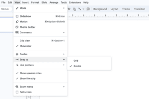
- Go to the “View” menu.
- Select “Guides” and then “Show guides” to display guides.
Setting up guides:
- To add a guide, right-click on the slide, and choose “Add vertical guide” or “Add horizontal guide.”
- Drag guides to position them as needed.
Shortcut keys:
- Show/Hide Guides on PC: Ctrl + Alt + E then Ctrl + Alt + G
- Show/Hide Guides on Mac: Ctrl + ⌘ + E then Ctrl + ⌘ + G
The difference between grids and guides in PowerPoint and Google Slides
Grids and guides are often confused, and the terms get used interchangeably. However, they are two separate tools – both developed to assist you in positioning elements in your slides more consistently. Let’s ensure that we’re clear on the differences.
Guides
Guides are individual lines that you can manually place on your slides. They do not form a full grid on your slides. Instead, they can be placed horizontally and vertically, where you need them, to help you align items. This tool is better for precision in terms of individual items.
Here is an example of a guide set up on a master level:

Here is the same guide, with added column spaces (also called gutters). These allow you to keep consistent spacing between paragraphs in columns:

Grids
Gridlines form a complete grid over your slide, consisting of intersecting horizontal and vertical lines. These lines are evenly spaced across your slide to help you ensure your layout is well-structured.
This tool is used to maintain consistent spacing and alignment across several elements, without too much trouble. In most cases, grids are used in conjunction with a function called “Snap to Grid”, which helps objects align to the nearest grid intersection automatically. This is a great tool to use if you have not been provided a specific guide layout by a professional but still want to have your layouts spaced correctly.

Tailoring Google Slides and PowerPoint grids to your presentation
When using grids in Google Slides or PowerPoint, you should keep in mind that different presentation types will need different grid layouts. It’s crucial to select the right grid ratio for your presentation purpose. Here are some ideal layout ratio suggestions for widescreen presentations (16:9):
Conference decks (16:9):
If you’re preparing a slide deck for a conference, it’s best to use a 6×4 (six vertical, four horizontal) grid to keep your layout clean and straightforward. This ratio provides enough space for images and text without cluttering the slide.
Digitally sent decks (16:9):
When you’re sharing slides online, you should opt for a 4×3 PowerPoint grid to organize more detailed information. This setup helps fit more content neatly and ensures readability.
Mini-conference/boardroom decks (4:3):
A 4×3 grid works well for smaller, more intimate settings. So, if you’re planning on presenting your slides in a boardroom or a conference room, then go for a 4×3 Google Slides or PowerPoint grid. This ratio ensures that key points are visible and not overwhelming and the square format benefits from a simpler layout.
Using this direction, your information should be set up smoothly and should look sleek.
Smart guides: Your alignment ally
If using guides feels overwhelming, both programs offer Smart Guides. These dynamic lines appear as you move objects, suggesting optimal alignment to nearby elements. Smart Guides are incredibly useful for quick alignment without manually setting up guides.
PowerPoint:
Smart Guides are commonly enabled by default. As you move objects around, dashed lines will appear to help you align them.
If they are not already enabled, follow the below steps.
- Click on the “File” tab at the top-left corner.
- Select “Options” to open the PowerPoint Options dialog box.
- In the left pane, click on “Advanced.”
- Scroll down to the “Editing options” section.
- Ensure that the option “Automatically align shapes to guides and grid” is checked.
- Click “OK” to apply the changes.
OR
- Right-click on the slide
- Navigate to “Grid and Guides” and hover on it
- Ensure “Smart Guides” is checked
Should you want to disable them, here’s how:
- Navigate to the “View” tab on the ribbon
- Click on the drop-down arrow next to the “View” tab
- Select “Grid and Guides” from the menu to open the dialog box
- Uncheck the box labeled “Display smart guides when shapes are aligned
- Click “OK” to save your changes and close the dialog box
Google Slides:
Smart Guides are also enabled by default. You’ll see red lines appear to assist with alignment when moving objects. However, if they are not active, you can turn them on by following the below steps:
- Click on the “View” menu at the top of the screen
- Ensure that the “Guides” option is checked
- In the same menu, ensure that “Snap to > Grids” or “Snap to > Guides” is checked
Pro tip: Using BrightCarbon for setting up guides in PowerPoint quickly
BrightCarbon offers a free add-in for PowerPoint, called BrightSlide. The tool simplifies the process of setting up guides and allows you to create a grid of guides quickly and easily, which can save you time and ensure precision.
This add-on is only available for PowerPoint, and not Google Slides.

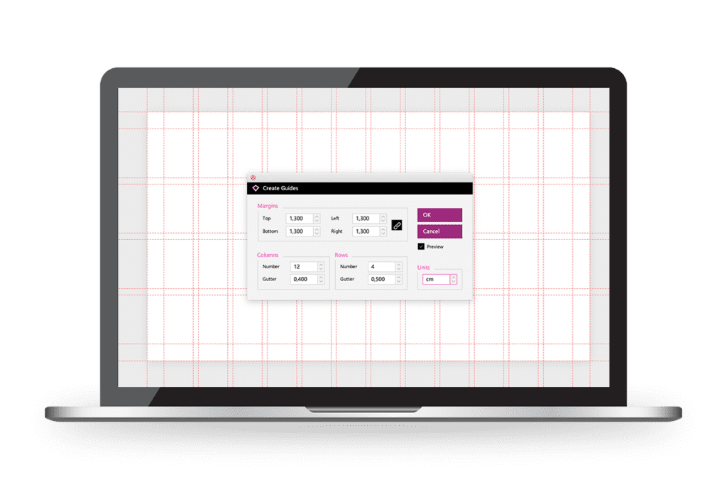
How to install and use BrightSlide:
- Download the BrightSlide Guide Add-in from the BrightCarbon website.
- Follow the installation instructions provided.
- Once installed, you can access it from the “Add-ins” tab in PowerPoint.
- Use the add-in to create custom guide layouts with just a few clicks.
Add a link to this video to explain more. This video also provides added helpful tools that BrightSlide can offer.
Best practices for PowerPoint and Google Slide design
No matter what tools you decide to use, ensure you’re always following the best practices for slide design. Here are some points to keep in mind:
- Keep your slides clean and uncluttered, and avoid excessive text and graphics that can overwhelm your audience.
- Use high-quality images and graphics sparingly to complement your content and enhance visual appeal.
- Maintain consistency in font styles, sizes, and colors throughout your presentation to create a cohesive look.
- Use white space strategically to draw attention to key points and improve readability.
- Practice good design principles, such as using contrast to make important information stand out and ensuring proper alignment and spacing for a polished and professional finish.
The alignment advantage: why guides rule
Incorporating guides into your PowerPoint and Google Slides presentation setup is a vital step in achieving professional and polished results. By using the right grid ratios for different presentation types, leveraging Smart Guides for quick alignment, and utilizing tools like the BrightSlide add-on, you can ensure your presentations are visually appealing and effectively communicate your message.
Whether you’re presenting at a large conference, sending a deck digitally, or speaking in a boardroom, these techniques will help you create standout slides.
If you find that you still can’t manage to get it right, consider contacting a presentation designer to help you out!

I'm Marike
I provide professional presentation design services specializing in PowerPoint, Keynote and Google Slides.
Follow me on social:
Buy US a coffee
Enjoying the content?
Show your appreciation...

YOUR Message*
YOUR NAME*
YOUR Email Address*
What's the slide count?*
where are you based?*
I'm ready! let's start
By clicking the submit form button you agree to my Privacy Policy.
Mail me directly at:
info @ marikedesigns dot com
June slots are available. Book now.
how did you find me?*
What's your deadline?*