June 14, 2023
The ultimate goal of any presentation you give is to convert your audience. Whether you’re pitching to investors, talking to your colleagues, or speaking to a board of directors, it’s likely you want them to be convinced of your ideas, and possibly even take action after the presentation.
To do this, you must ensure that you’re effective in multiple ways. For instance, you should ensure that your visuals are engaging by hiring a presentation designer, you should keep your presentation smooth by using shortcuts, and you should choose the right location.
Another element that really makes an impact is the words you use, especially in your slide titles. Read on to find out how to write engaging and converting slide titles in PowerPoint.
Slide titles in PowerPoint: Why they matter
David Ogilvy, one of the most famous copywriters of all time and the father of advertising, once said: “On the average, five times as many people read the headline as read the body copy.”

Ogilvy believed that 80% of readers focused more on the headline or the title of the body of text.
Essentially, this means that the headline – or the title – is the most important part of any body of copy. It’s important that you get it right because if you don’t capture people there, you might lose them and not get them back.
Also important to mention here is that it’s most common for people’s eyes to fall on the title first. It’s a natural reflex at this point, as people are accustomed to listening to talks and presentations.
So, the fact is that when writing presentations, slide titles should be top of mind.
6 tips for writing slide titles
Writing presentations can be overwhelming. But by writing slide titles, you can create an outline and story – making it easier to fill in the body copy. But that’s just a bonus!
Of course, as I mentioned, there are more benefits to writing great slide titles in PowerPoint presentations – such as conversions and engagement.
Here are some tips to get yours right.
1. Use action words
Reading and writing presentations are very sedentary activities, which can create a disengaging environment. But adding action-oriented language can counter-act that.
Action words such as “expanding”, “driving”, or “building” creates a sense of movement. Not only is this more likely to keep the attention of your audience, but it also is more likely to get them to take action. This is because, when reading the slide titles in PowerPoint, they are likely to picture themselves doing or participating in the activity that you mention.
2. State your main point
Ensure that your slide titles convey the main point you’re trying to make in each slide. For example, if you’re talking about how your company has affected others, you could say something like “Making an impact in the community”.
This way, the audience knows exactly what you’re going to talk about before you start, allowing them to mentally prepare and be more engaged with what you’re saying.
3. Keep it short, but not too short
Concise and brief headings are more impactful. If you’re making your audience read more than 10 words as a heading, they’re going to fall behind and then you’ll lose them.
In terms of slide titles in PowerPoint, less is definitely more. It not only allows for more clarity and shows you don’t mince your words, but it also stands out more when it’s short. Too long can make it feel like part of the body copy.
That being said, don’t make the slide title less than 3 or 4 words. This seems lazy and is not as engaging. In addition, too few words lead to a lack of clarity – creating the potential for confusion, which you definitely don’t want.
4. Ensure the location is consistent
If you’re putting your slide titles on the top left, keep them all on the top left. If they’re centered in the middle, keep it that way.
Once audiences see one slide title, they will expect the rest to be in the same place. If they keep moving throughout the presentation – people will lose focus and get lost.
Of course, there are exceptions to this rule. For instance, if you’re trying to “wake up” your audience. Often this is done on section slides and team slides.
5. Consider your tone and style
As you’re writing presentations, keep your tone and style of slide titles in mind.
An inconsistent tone can make everything feel disconnected and out of place. If you’re speaking formally, keep it formal. Going back and forth is going to give your audience mental whiplash.
Similarly, keep the style of your slide titles in PowerPoint consistent. Should you decide to do a heading and a subheading, try to do that for as many slides as possible. If you’re only doing one short heading, keep it that way across the slides.
Again, this is just about making it easy for readers to find the information they need.
6. Avoid unnecessary punctuation
Punctuation marks do not need to be in headings, and they may simply end up cluttering the heading space. It’s best to just leave them out unless they’re really necessary.
At times, punctuation marks like exclamations can even make your presentation seem a bit unprofessional, depending on the context you’re in.
In addition, marks like ellipses create a sense of tension or mystery that is not appropriate for slide titles in PowerPoint. Often ellipses also come across as lazy, as though you don’t want to finish your point.
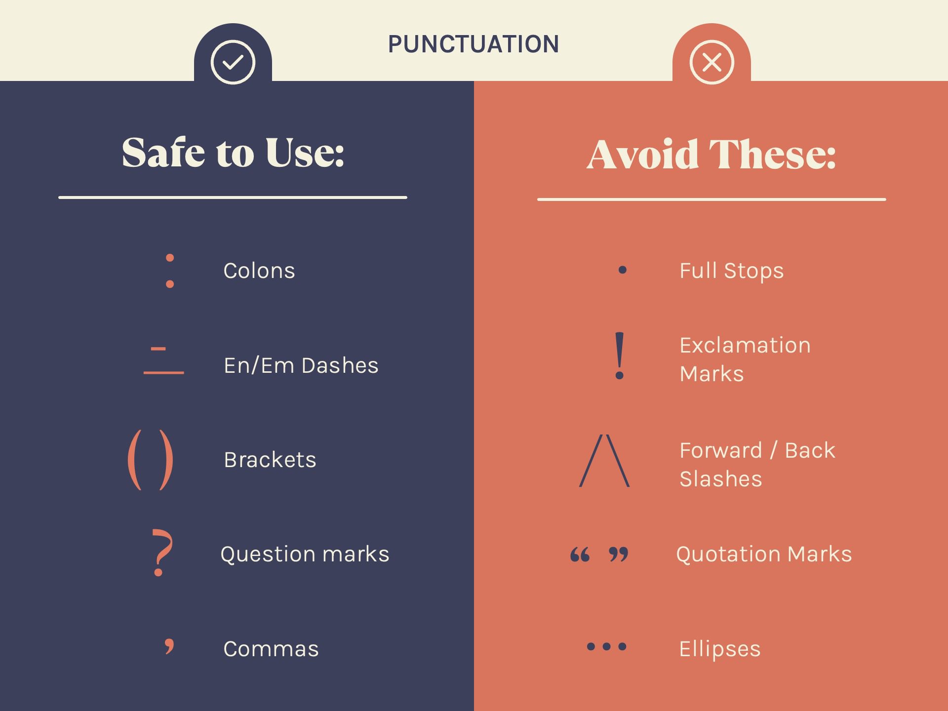
Safe punctuation to use:
- Colons
- Dashes
- Brackets
- Question Marks
- Commas
Avoid these:
- Full stops
- Exclamation marks
- Forward or black slashes
- Quotation marks
- Ellipses
Examples of good and bad slide titles
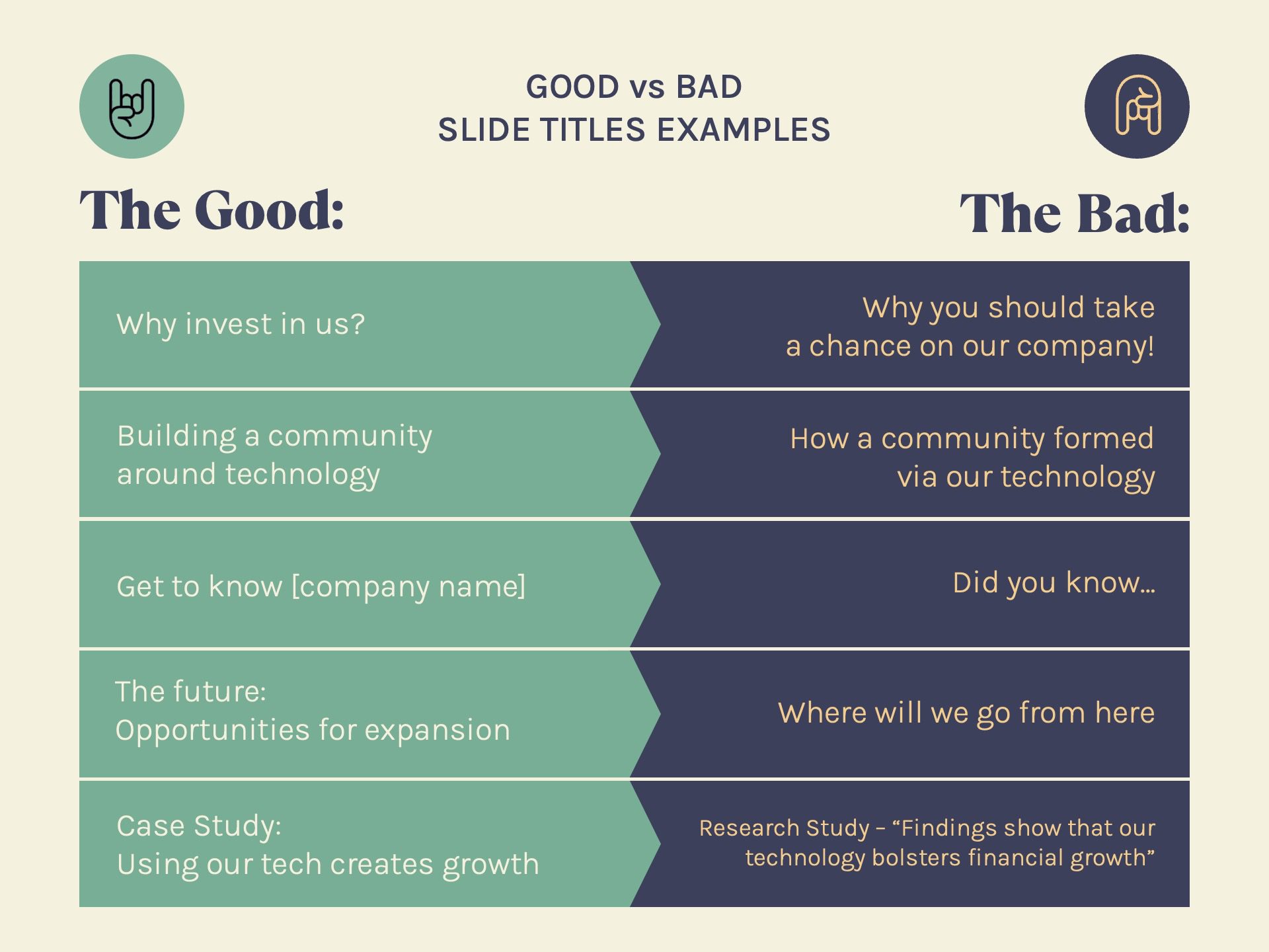
| GOOD TITLE | BAD TITLE |
| Why invest in us? | Why you should take a chance on our company! |
| Building a community around technology | How a community formed via our technology |
| Get to know (company name) | Did you know… |
| The future: Opportunities for expansion | Where will we go from here… |
| Case Study: Using our tech creates growth | Research Study – “Findings show that our technology bolsters financial growth” |
Sell yourself well with smart slide titles
Writing presentations involve the need for knowledge of not only your product but of copywriting best practices too. If you’re planning on writing it yourself, be sure to keep these tips in mind when you’re working on slide titles.
They’ll help you stick to the point, and achieve your goals of engaging and converting audiences.
If you’re looking for even more ways to keep people’s attention, consider getting your slides professionally designed. I can help you make them stand out from the rest!
I'm Marike
I provide professional presentation design services specializing in PowerPoint, Keynote and Google Slides.
Follow me on social:
Buy US a coffee
Enjoying the content?
Show your appreciation...
YOUR Message*
YOUR NAME*
YOUR Email Address*
What's the slide count?*
where are you based?*
I'm ready! let's start
By clicking the submit form button you agree to my Privacy Policy.
Mail me directly at:
info @ marikedesigns dot com
June slots are available. Book now.
how did you find me?*
What's your deadline?*

