January 9, 2024
Looking for a PowerPoint template design? The chances are you’re probably not – but you think you are.
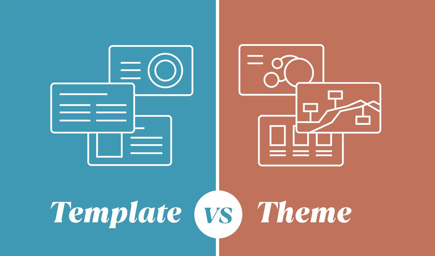
Find out below why there’s a 50% chance you actually want a design theme – and learn about the difference between a theme vs a template so that you are prepared for all future presentations!
Presentations make the business world go around
These days, PowerPoint is part of the lives of business people across the world. Whether you’re a freelancer or a C-Suite executive, you have and probably will again use slides to showcase your ideas, solutions, and accomplishments.
Despite how widely the program is used, many are still confused about various aspects of creating presentations in PowerPoint. According to Visme, 41% of presenters find it difficult to find and use great visuals in their presentations, and 45% of presenters find it challenging to design creative layouts.
Some just power through and create what they can, while others may outsource the creation of the slides. Either way, a key component to getting your slides to shine, is to know exactly what you’re looking for. Specifically, you need to know the difference between a design theme and a PowerPoint template – and which one it is you really need.
Breaking down PowerPoint template vs a theme
It’s a common mistake to confuse themes with PowerPoint templates. Have you done this? Don’t feel bad if you have – it can be tricky!
Here’s what you need to know to avoid the mistake in the future, and so that you know how to brief your presentation designer for any upcoming presentations.
What is a PowerPoint theme?
A theme is what a designer would create to make your slide look professional, appealing, and stylish. It is brand focused – using your company’s fonts, colors, imagery, design elements, and iconography.
What happens is – you have your content, graphs, and charts ready to go, but you feel it doesn’t look as great as you’d like it to. You then send it to a designer and they implement what is needed to make it more interesting and coherent – to make it “pop”.
Having a theme ensures that your presentation has a consistent and harmonious appearance.
What is a PowerPoint template?
A PowerPoint template is a presentation design format that gives you more control. It is something that you can reuse over and over again. Essentially, it is (almost) a blank canvas, a basic guide in which you can place your content.
When you know you’ll be doing several presentations about different topics, but you aren’t really sure what the content will be – a PowerPoint template is what you’re looking for.
When you approach a designer for this, they will create a deck that includes your brand guidelines – color scheme, fonts, and design elements – and most importantly they will include placeholders for the content you want to add through the use of designing Master Slides. You can think of this as though the designer is providing you with a well-designed, branded, layout for your presentation content.
PowerPoint templates maximize the capabilities of Master Slides to ensure the file is user-friendly. Master slides allow for easy access to the templated slides so you won’t need to duplicate slides each time and content like footers and logo placements are always in the same place and not moveable so you won’t have to fuss with them.
Templates save you money in the long run – if you’re doing many different presentations.
To sum up the confusion on PowerPoint templates vs themes:
-
- A theme will dictate the way your existing information looks in the slide deck, along with applying branding across all slides.
- A PowerPoint template will dictate the layout of potential content on each slide in the deck, along with a theme.
When you truly want a PowerPoint template you don’t have content yet. When you ask for a themed presentation, or a redesign of an existing deck, your content has already been written and finalized with very few copy changes needed.
What is the presentation theme vs template challenge?
So now you’re clear on the difference. It may still be confusing to decide what you really want at this point.
Most often, designers are approached with this proposal: “I have a presentation and I’d like a template for it – please could I get a quote?”
Half of the time, after some investigating – designers find that the client does not actually want a template, they want their existing presentation to be re-imagined and styled well. This leads to incorrect quotations.
At the core, the challenge is the word “template” itself – it is often misused – and that’s what I’m hoping to clear up here!
Here’s what you really want: Theme vs template
You want a PowerPoint template:
If you’re doing weekly meetings, constant internal communications, and/or monthly round-ups – you most likely want a template. It allows you to change the content easily without messing with the aesthetic of the slides while still having the base of the slide decks coherent and consistent.
Many people prefer to do these “smaller” scale presentations on their own and don’t approach designers for assistance since they occur so often. It is more common for people to approach designers for help with presentations of a larger scale, or of “more importance”. This is why – usually – people are not looking for a template specifically.
You want a PowerPoint theme:
On the other hand, if you’ve made your sales pitch or created a business proposal and finalized the content but you want it to look professional and stylish – then you want a theme for your PowerPoint presentation.
After the designer hands this back over to you, you will barely need to make any changes to it. Of course, you will have the ability to edit if the need arises.
In many cases, people will request a template first, to use at their own disposal. Thereafter, once an important enough occasion arises, they will ask for their content to be added to the presentation in a themed manner. Because adding content on their own may not be as aesthetically pleasing. When a designer does it, the before and after are coherent and beautiful.
Present your points with power!
Forbes found that more than 35 million PowerPoint presentations are given every day to over 500 million people. To make yours stand out, you have to ensure you’re using the tool correctly – and understanding the difference between a theme and a template is a powerful place to start. It sets you up and sends you in the right direction.
Remember to keep this information in mind whether you’re creating your own slide deck or outsourcing the creation. For more presentation tips, read more on my blog.
I'm Marike
I provide professional presentation design services specializing in PowerPoint, Keynote and Google Slides.
Follow me on social:
Buy US a coffee
Enjoying the content?
Show your appreciation...
YOUR Message*
YOUR NAME*
YOUR Email Address*
What's the slide count?*
where are you based?*
I'm ready! let's start
By clicking the submit form button you agree to my Privacy Policy.
Mail me directly at:
info @ marikedesigns dot com
June slots are available. Book now.
how did you find me?*
What's your deadline?*


